Case Study:
Vaccine Dashboard Dataviz & Reporting
Aiding Medical Practices with managing vaccine inventory and predicting trends through data visualization.
The Innovation Lab at GSK, always hungry to empower their customers, sensed a huge opportunity to help Medical Practices draw actionable insights from vaccine data trends and their own Y-O-Y purchase history.
Insights, not just information…
Making meaning out of historical data
In 2018, GSK’s Innovation Lab was just getting into full swing. Among other major public health issues they were examining, they turned their attention to how they could offer medical practices & medical groups better visibility into trends and insights in their historical vaccine data.
Not just a spending issue
Vaccine viability has as much to do with storage and handling as it does with anticipating trends in public health and preparing for seasonal needs of families and individuals.
Critical issues like under-ordering can see a practice inundated by demand while over-stocking can see a practice under fiscal pressure and prone to waste. Like many logistical issues, GSK knew this was more than just a way to provide data to long term customers, but a clear opportunity to give tools to the medical providers who play a huge role in public safety.
Exploring the data…
Faux data is no data, or Why a UI Kit is not a solution.
In a world full of well designed UI Kits, you’d think pulling together an interface for a dashboard would be as easy as choosing a chart style from a UI Kit and plugging in some figures to give it an “organic” feel. But it’s important not to be lured into the expedience of designing an interface before thoroughly exploring your data.
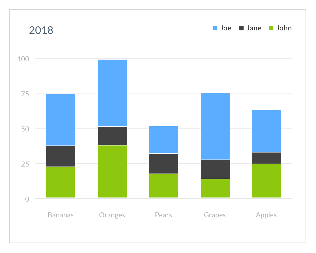
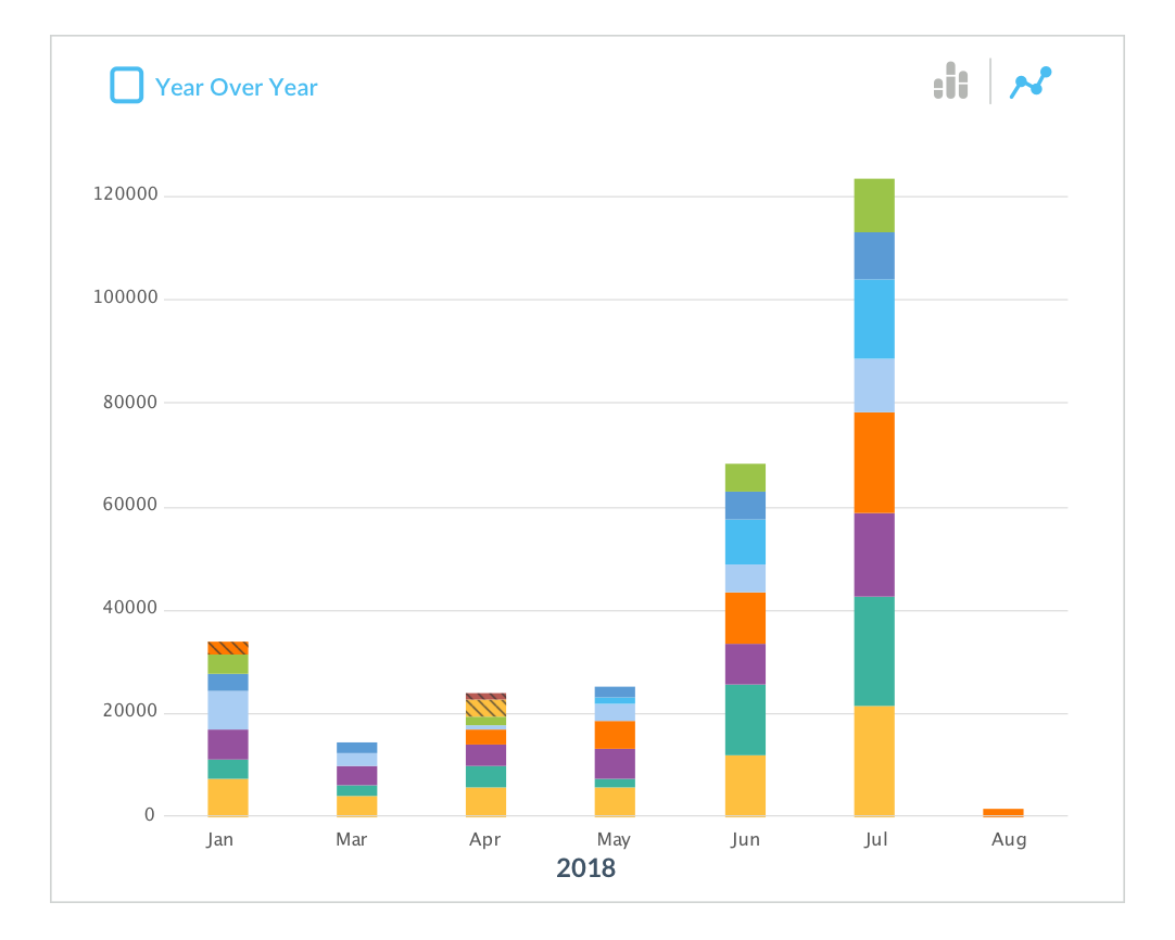
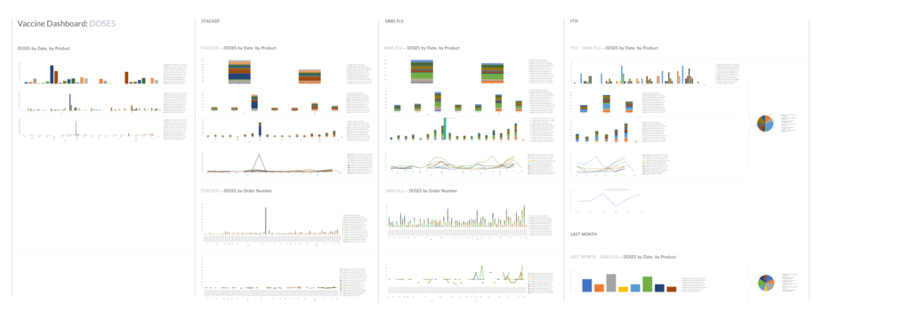
Compare these two stacked bar charts in the slider above.
Sliding right, we see an example of a stacked bar chart using fake data, it’s clean and clear, checks all the boxes one expects of a chart of this type…
Sliding left, is a chart that models the real data and it immediately conjures anticipated problems with legends, hover states, and programatic palette generation that the previous chart hides.
Second iteration blues
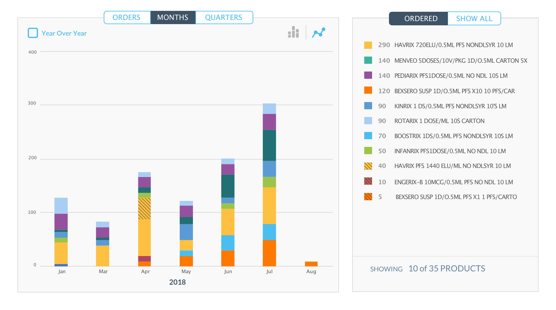
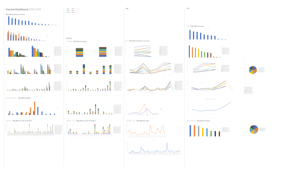
Below is a follow up iteration exploring this style of legend inside the chart with data modeled on real world circumstances.

We can see the legend in this example fits fine but only when the data permits. As the data moves through the year or the user moves through the data we will have visual impact and usability will suffer as UI element collision will obscure the ability to explore the chart.
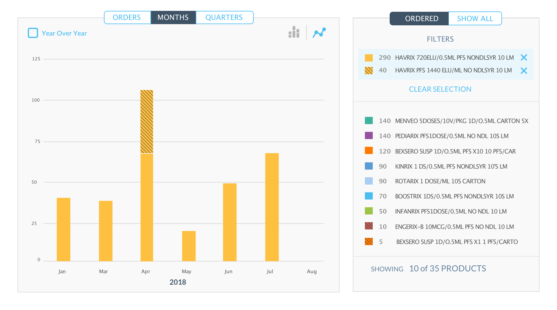
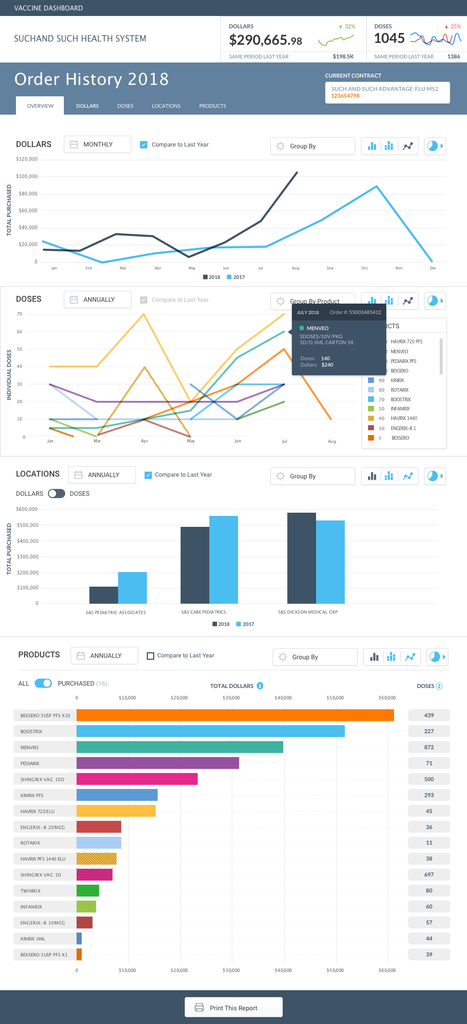
In the slider below are some examples of later explorations that give the ability to filter by product and time scale suggested by our users. Slide left to see the data filtered, slide right to see it unfiltered.
Why using fake data is a mistake:
If you’ve been building things with teams for any length of time, you’ll likely see the danger in the above list. It’s better to start with a grey box that says “Year over Year Data” than get a team comfortable seeing a solution that you’ll have to change.
Outliers and ill-fitting paradigms…
Diving head-first into Excel pivot tables, outliers, and dead-ends.
Before we could get started, we knew we needed to see some real world data, we’d need to figure out how to parse that data, and get it into charts and graphs to present it meaningfully.
A false-start with faux data lead us to conversations with the e-commerce data team. We decided that aggregated & anonymized data modeled on all the idiosyncrasies of real-world scenarios as seen by individual practices and small-large medical groups was the only way to go.
Excel Pivot Tables, dataviz on the fly…
Here’s a secret, Microsoft Excel is a dataviz prototyping power house… Turns out this tool I previously considered an obtuse table based obstruction is actually an amazing way to quickly explore data visualizations. Excel Pivot Tables gave us all the power we needed to start mocking up the data so we could zoom in on what our UI would need.
First order of business, outliers.
The three graphs above demonstrate how meaningful it is to use data modeled on real-world circumstances.
We see how seasonal spikes skew the chart (1), making it almost unusable. However, even after adjusting for outliers we see that a month-to-month line graph depicts one-time and intermittent orders as trends up or down(3), while misrepresenting usage and restocking as static periods (2).
Choosing the wrong visualization for the data you have is a common way to create skew. It was clearly time to better understand what our customers needed from this information and how they intended to use it.
Further Explorations
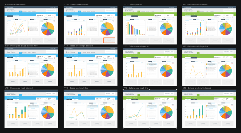
After hashing out the issues with the data visualizations we set to work designing interactive charts with all the power Practices had indicated they would need.
Slicing the product into intuitive sections, providing granular filters and navigation in context to the data, and tweaking the palette for maximum clarity in the face of occasionally very complex charts – we set out to mockup the experience.
Mockup, Prototype, Validate, Repeat
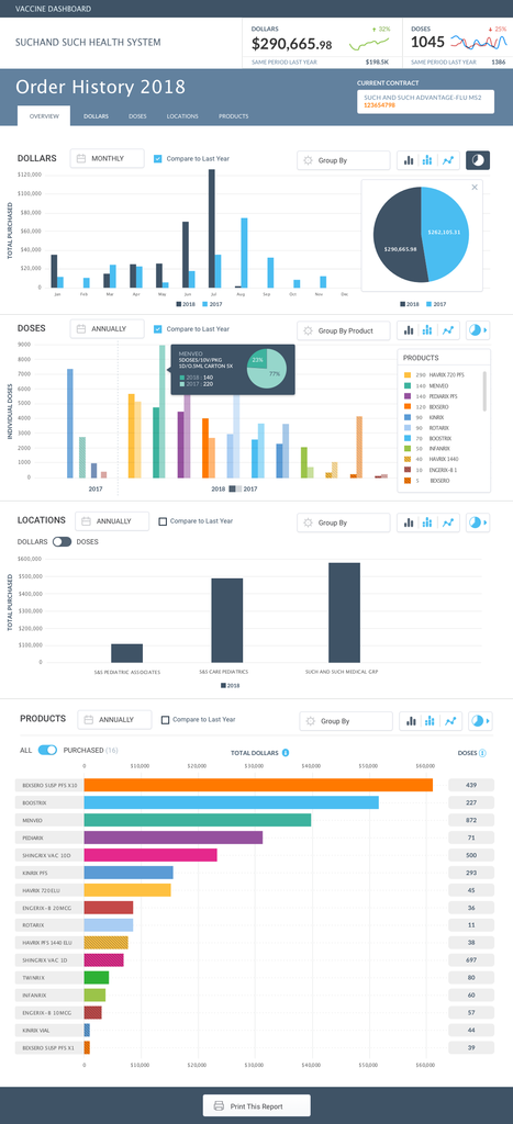
With a combination of lo-fi clickable PDFs and more involved Marvel and Axure interactive solutions we validated and tweaked until users could find everything they needed. With an eye towards offering discovery of the key relationships that had previously been hiding in flat spreadsheets, invoices, and annual accounting – we could now offer a full suite of exploration and reporting tools.
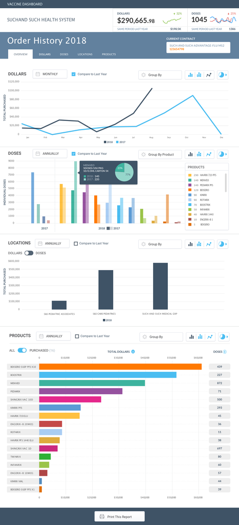
The GSK Vaccine Dashboard demanded equal parts data visualization, user validation, and UI innovation… Ultimately, we met our goal: To provide an interface into existing data in a way that generates actionable insights, helps practices better predict their needs, and reduce overhead & over stock – thereby increasing the efficiency and availability of vaccines to the public at large.
GSK continues to constantly improve products and services for its customers in an effort to increase vaccination rates for preventable illness among a myriad of innovative initiatives they are engaged in.
GET IN TOUCH
Let’s Talk
To talk more about this project and similar needs you may have, feel free to reach out.