Case Study:
The American College of Physicians
A modern design system for clear organization & simplified content delivery.
An easy way for content creators, manager, & editors to find the best form for the information they want to share with visitors and most importantly — members.
ACPOL UI Kit
With 161,000 members, ACP is the largest medical-specialty organization and second-largest physician group in the United States
The American College of Physicians (ACP) is a Philadelphia-based national organization of internists, who specialize in the diagnosis, treatment, and care of adults. With 161,000 members, ACP is the largest medical-specialty organization and second-largest physician group in the United States, after the American Medical Association. Its flagship journal, the Annals of Internal Medicine, is considered one of the five top medical journals in the United States and Britain.
Identifying the Problems
The leadership at ACP knew it was time to update their web presence. The aging static design that was making content management increasingly difficult. Along with an identity update including log and color changes they wanted to address the membership’s consensus that the site was too complicated.
The first step was diagnosing the nature of the problems…
Initial UX auditing made it obvious the College was pushing way too much to every page in an effort to raise awareness to the great diversity of information the College has to offer their membership.
Without an intentional system designed for high quality paths between sections, content specific templates, and clear calls-to-action to leverage – content managers begin competing with each other for users’ attention causing significant clutter that degrades complex sites over time.
Nate Pershall
After a short review and discovery phase it was obvious we could increase efficiency and simplicity if we offered fewer higher quality paths between the site’s key sections & resources.
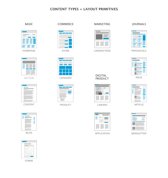
It was imperative the we design a way to classify and present content of specific types in ways that was instantly identifiable.
Product pages, Article content, Link Lists, Apps, Events, Calendars, and various Reference Materials all needed to be delivering their information with clarity and obvious calls-to-action with the least distraction possible.
A thorough survey of content and several interviews with various individuals charged with content creation + management duties gave us the critical information needed for the creation of the refines site architecture & layout diagrams that would become the templates for the Drupal CMS that would house the new site.

There is always a system at work for anything we do repeatedly, when we don’t take the time to design that system with intention – we are leaving that system to be designed by chaos.
-Nate Pershall
The next step was the development of static wireframes to verify we had all the necessary content containers, content types, and calls-to-action in place before we could move to prototyping… We took our layout diagrams and pulled in examples of all of the content we could expect to include in actual pages for products, landings, events, etc.
Prototype, prototype, prototype – If you want stake-holders, content creators, and users to be on the same page with what you’re thinking, planning, and building – there is nothing that can replace the value of an interactive prototype.
Nate Pershall
Getting Buy-in
Buy-in from each of the department-owned sections of the site was going to be a significant effort.
To avoid editing & maintaining versions of a massive amount of static graphic files and to relieve Content Owners of the responsibility of visualizing the site as an abstraction, we built an interactive prototype that would be simple to use and edit, always available on an internal IP address, and make turn-around times and edit-approvals a whole lot simpler & faster.
Everyone along for the ride…
That’s how you get to the destination you set out for.
The final product was a modular stacking design system that could be coded into template sections and chosen by content managers as needed…
This implementation is still in progress but with a bit of effort we got the College to realize that the new face of web based projects is a cycle of small planned enhancement not Herculean bursts of effort spaced 5-10 years apart.

GET IN TOUCH
Let’s Talk
To talk more about this project and similar needs you may have, feel free to reach out.
