Case Study:
the City of Philadelphia
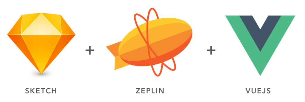
Setting up a consolidated UX/UI Pattern Library and a streamlined pipeline from designers to developers with Sketch + Zeplin + Vuejs.
The Dev team in the City of Philadelphia’s Office of Innovation & Technology under increasing demand needed to streamline it’s pipeline with the UX/UI team. With a fresh Vue.js code base being built it was time for the design team to meet them half way.
Bridging the Gap
New to the UX team at the City of Philadelphia I quickly realized there was a huge opportunity to improve user experience consistency in a lot of the exist applications and some currently in development.
Like many public institutions, the teams in any given department are being over leveraged… and none more so than development teams these days.
With increased demand to digitize access to all City processes, information, & resources mixed with expectations of digital products ever increasing as the proliferation of smart phones slowly move people from desktops to smaller screens – it was passed time for the dev & design teams to consolidate their disparate UX patterns and UI into a central resource.
Assessing the Needs
With a box of donuts in hand, we started by sitting down with the critical dev team leads to hear just what kind of challenges they were up against and what obstacles we could start minimizing.
It’s an ad-hoc life…
It was very clear from the start that the dev team was working full steam ahead. Many of their projects were not only critical for the public but under tight immovable deadlines and fielding ad-hoc changes as new requirements and issues were coming in.
All skilled and seasoned software engineers, they had already realized that consolidating their code base was going to be crucial to their productivity. In fact they had already set their eyes on Vue.js as the future framework and had found a small UI Code Library they were ready to style.
As a seasoned UXer I knew there was a huge opportunity to relieve them of some of the overhead of choosing UI and if we could work it out remove a huge burden of customer demands on application UI/UX changes by centralizing some of what they’d already built into a UX pattern library.
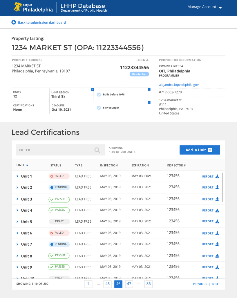
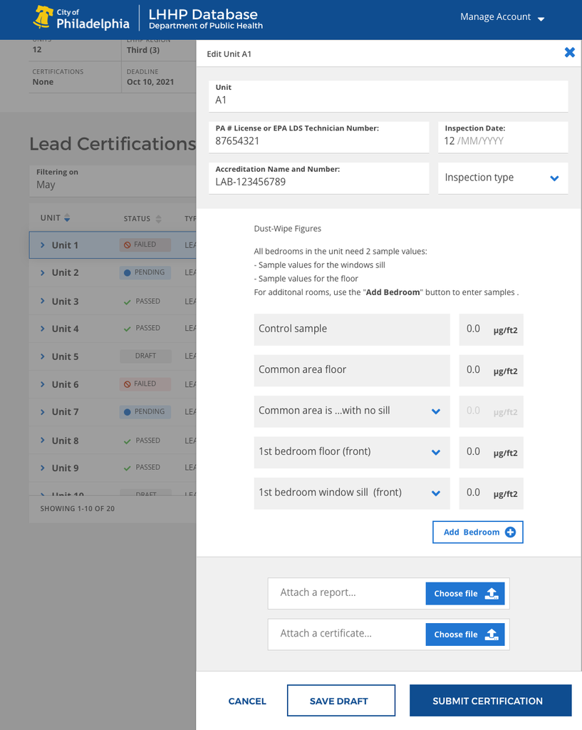
Time for a comprehensive review…
Fixing what you can while you plan…
UX debt is real, and developers suffer from it almost as much as users. But when your users are residents that need access to critical government resources like utilities, or need to pay a fine to avoid legal trouble… the user feels it all the more.
Like double-dutch line-cutters the UX team in the Office of Digital Transformation was jumping in where ever there was space.

Whether it was an error message, consolidating the login experience, or hashing out user flows for applications still using code-names… there was quickly a Sketch file for every need…
Indeed, there was already a full library of UX & UI Patterns for the wesite from the in-depth work the UX team had done leading up to this effort. The team I joined made a name for themselves as the upstarts in charge of overhauling all the disparate legacy design of individual office and department sites into the cohesive redesign of the Phila.gov initiative.
So, there was already a strong direction set, leaving the primary task of documenting and pulling what we could under that effort where possible.
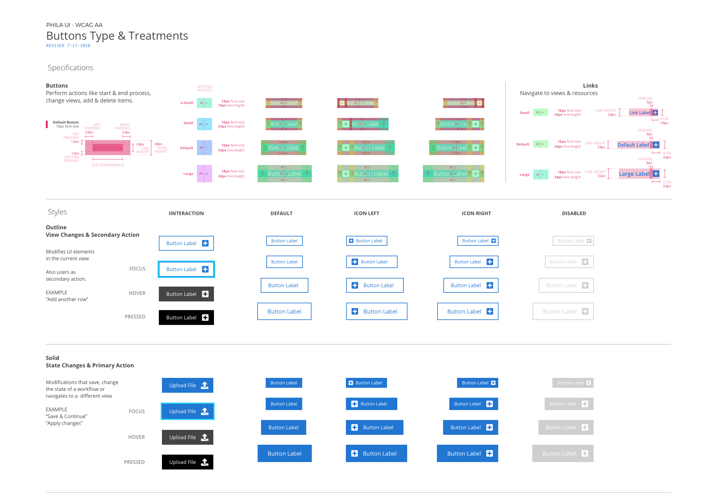
What’s in a button?
Any designer can choose dimensions and colors at whim. What we needed was a plan
- Consolidate the Phila.gov website UI/UX into a single resource
- Do a comprehensive review of exiting apps & digital resources
- Identify effective legacy app UX/UI patterns
- Leverage existing Phila.gov website UX/UI patterns
- Consolidate all of that into a living design resource
- Establish a pipeline to the dev team that they want to use
WCAG 2.0
Web Content Accessibility Guidelines (WCAG)
On top of all that we needed to be sure that what we were designing and developing came as close to fully WCAG 2.0+ compliance as we could get…

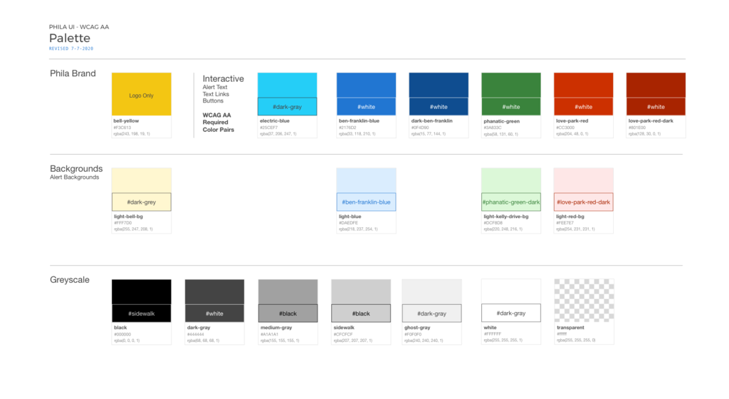
Having been through this process with several teams large and small where I was a design/dev resource, I was pretty confident I had something that would work and that would automatically convert design files into css/html ready to copy as paste needed.
Enter Zeplin
Sketch plugin, code generator, mockup tool in one.
By the time we got around to including Zeplin in the pipeline we had scoured the existing styles and combed through many existing patterns.
We had throughly tested color palettes in combination with font styles & weights, done a thorough review of the devices COP was logging in analytics to shoot for the lowest tech barrier to ensure everyone who could access a resource would find a usable resource.
Demoing Zeplin illustrated how we could use centralized Sketch Libraries to stay synced in the Zepling resources. In Zeplin developers could comment, question, interact, and once changes were committed- simply copy and paste the necessary code into their code.
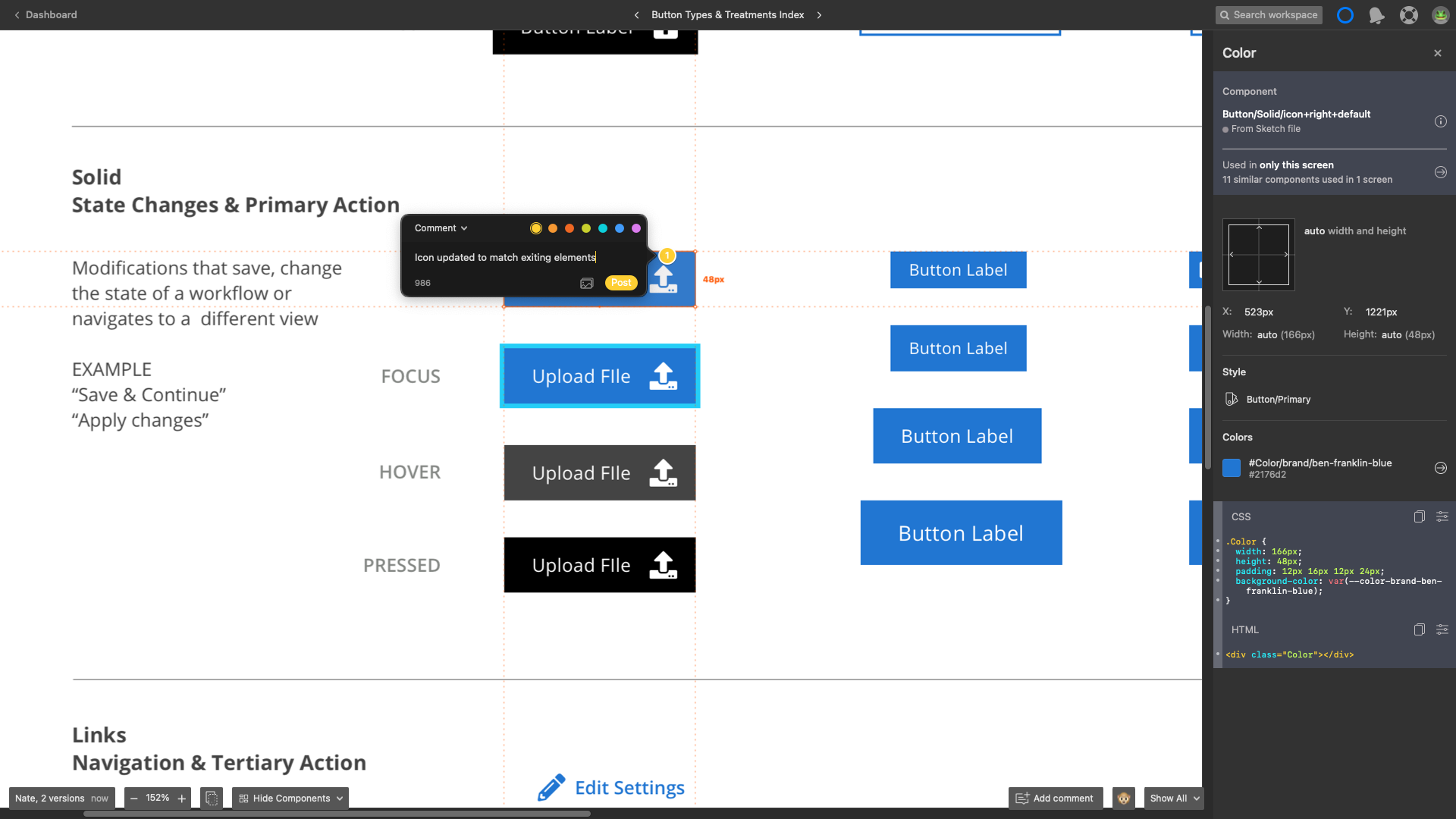
Moving things through the pipeline
Elbow to elbow with the dev team we refined our UX/UI resources into a growing library that any dev or designer could access… not just access, but comment on, reference in sprint reviews, and have solid conversations about without ambiguity.
With a dedicated and talented UX team creating a delivery/feedback loop for UI Libraries and UX Patterns there’s no limit to what the highly competent group of software engineers leading application dev at the City of Philadelphia’s Office of Innovation & Technology can accomplish.
Digital Products created by the COP for its residents, businesses, interest groups, agencies, and visitors continues to set the benchmark for how technology can keep government invested and engaged.
Reach out with any questions about how solutions like this might help you address needs and challenges you might be facing.
GET IN TOUCH
Let’s Talk
To talk more about this project and similar needs you may have, feel free to reach out.
