Case Study:
Medical Knowledge Self Assessment
Updating the most trusted resource in continuous learning & board prep for Internal Medicine Physicians & Residents.

As the flagship product from ACP, industry leading MKSAP 17 set the standard for self guided learning tools for Residents trying to pass the ABIM Board Exam, for practicing Physicians meeting continuing education requirements, and as a reference for staying up-to-date with recent changes in medicine.
With a great development team, seasoned project management, and an eye toward user experience – we made this version of MKSAP more reliable, more usable, and more effective than any before it.
MKSAP 17 offered a clear and configurable reading experience, seamless connection between text & question content to facilitate different learning styles, and useful reports on user progress – whether their goals are ABIM Board Exam Practice, MOC/CME or subspecialty knowledge.
Leading the industry…
Before MKSAP 17, board prep & subspecialty medical education had not offered a fully digital product with the sort of learning environment that addressed the complexities of things like device flexibility, configurable reading experience, and deeply integrated study/self-testing environment for the sort of reinforced learning that self-study research was indicating was most valuable.
Underpinning the effort to re-design MKSAP, this version was anchored in understanding user needs from the outset and pairing that with leading front-end development practices, accessibility, and mobile-first principles.

Using CSS 3, HTML 5, React, Node, Grunt, Rails, and other tools we were cutting our teeth on how to feed content, images, and tests to users without compromising their experience. Whether it was a resident on break engaged in a mobile-based self-test, a long night desktop study session, or a practicing physician in commute chipping away at CME (continuing medical education) or MOC (maintenance of certification); We needed this version of MKSAP to do it all.
Plotting the course…
ACP being a leader in the Medical Education space and the largest Internal Medicine Membership group meant we had a mountain of willing users who were highly invested in offering feedback, plus years of data to plumb for answers to deeper questions about past products and future expectations.
We were on the precipice of a whole new tech stack and it was obvious that we needed to understand users and how they wanted to study.
That of course means research, user interviews, and surveys.
- Where were people studying most?
- How was mobile/tablet usage changing expectations?
- Do residents study differently than physicians?
- How were people using the books in ways the previous digital tools may not accommodate?
- How was a growing education market solving similar problems in ways we may not have been considering?
Feedback and research was turning the tide of our conversations and expectations of the design and tooling we’d need to meet user needs…
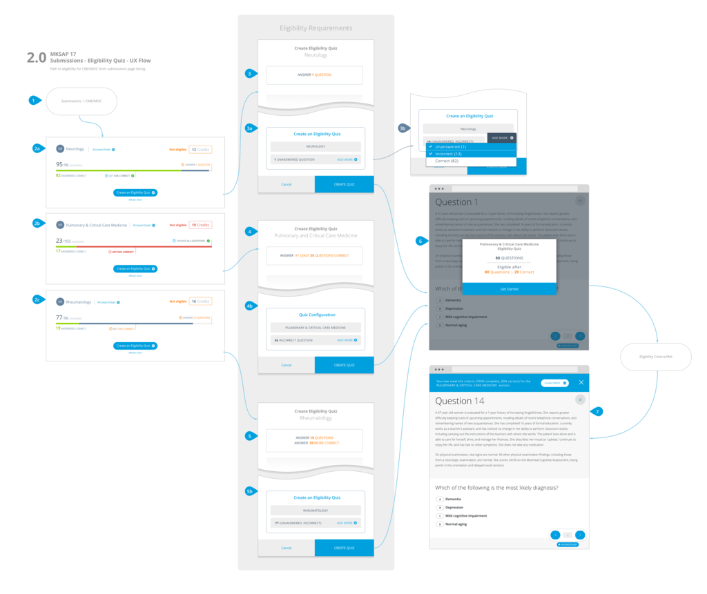
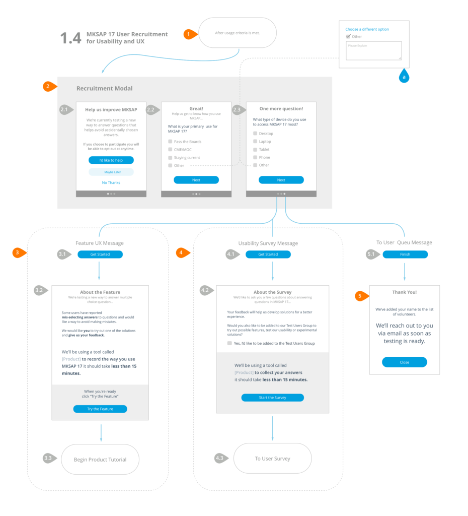
With a solid idea of our User Personas, Empathy Maps of their challenges, Journey Maps of their days and months in study, and User Flows examining their analog study experiences and their new digital expectations were critical to not just to empathize & understand users for product decisions but as a source of truth for stakeholder and development.
Having these assets as a point of reference for the decisions that have been made and as a blueprint for what you’re building & how it should work can be as helpful as a rudder on a boat trying to keep from listing.
UX Maps in Developer Hands
Socializing all the findings with the team was essential to an expedient design & development cycle and laid the groundwork for productive conversations about how to meet user needs with pragmatic implementation goals.
Wireframe, Prototype, Validate, Repeat…
No modern product should ever see production before being tested and likewise no product should start development until the decisions we’ve made and features we’ve designed have been validated by users.
MKSAP 17 set new record for feature design exploration and the process was a shoulder-to-shoulder effort between stake-holders, users, and an accomplished team of project mgmt. and forward looking developers.
That meant it was critical that ideas and concepts needed could be wireframed as quickly as concepts were discussed, prototypes needed to clarify what we expected users to see & do, and our biggest risks needed testing & vetting by users.
Early concepts & wireframes
Concept to completion in 6 months
An extraordinary project timeline for even a small project with a goal to be device agnostic, user validates, and with an entirely new code-base with a sea-change for back-end and front-end paradigms; MKSAP 17 went from a few modest ideas to a functional industry leading tool actively educating a new generation of physicians in record time.
A testament to what highly competent teams can accomplish working elbow-to-elbow in true agile fashion sprinting toward pragmatic goals under good leadership.
The designs and UX Patterns set forth in MKSAP 17 still guide the product even as it grows almost a decade later with MKSAP 19.
Product Demo
See MKSAP 17 working below…
GET IN TOUCH
Let’s Talk
To talk more about this project and similar needs you may have, feel free to reach out.


